EV Index Redesign
Redesign of an analytics tool with all EcoVadis date from rated companies gathered over the years. The tool is updated every year with new set of stats and this year with new statistics we decided to improve usability and accessibility as well. Main aim with this project was to bring usability back to the tool, rework filters and navigation. I also took upon a challenge of developing new colour palette for data visualisation that would be accessible. And could be mirrored in PDF report, so user can have smooth transitions from specific chart in PDF report to online tool.
- a11y
- Research
- UI
- UX

Main Page Gap Analysis and Improvements
Conducting an audit of the page provided a lot of errors and potential improvements. The aim here was to update the tool than rather completely redesign it. Tool is viewed every year by hundreds of researchers, reporters from Sustainability field.I focused on updating analytical part mainly but i also had to bring some improvements if it comes to main page.
Navigation and Content Structure
#1 Menu, previously it was shown on the side- witch wasn’t really user friendly. It was hidden at the beginning, while scrolling, menu was triggered and showing. I moved it to the top and made it sticky. So it is always showing.
#2 More accessible Colour Palette. I used darker version of our brand green colour on CTA’s so they are compliant with AA WCAG Standards.
#3 Rearranged content on the page so User can quickly accomplish what they come for, which is reach out data.
Data Pages
All data pages were overloaded with tooltips that were fading in and out, i presume that intention was to guide users and show them possibilities that the tool have but it made it distracting and not vey accessible. Menu was added permanently to the top and CTAs received darker green shade that was aligned with AA WCAG recommendations.
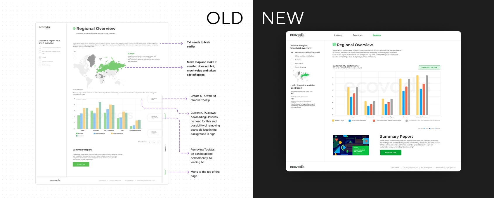
Region Overview Tab
Previously big map was a first and main element on the page that didn’t bring a lot of value. Main feature which is region comparison chart was hidden under the map. I moved the map to the side panel alongside with some insights from the region that are shown next to the chart. Now main focus is shifted to chart, it self.

Industry Comparison Tab
Main challenge here was to design filters that will be user friendly, intuitive and won’t bleed out of the page. The smoother the filtering interaction, the less cognitive energy user get to spend ‘learning ‘of the tool and focus more on the result of the chart.
I decided to stick with simple drop-downs for lists with 4-7 positions. For filter of ‘Company size’ I decided to use segmented control button to limit amount of space taken and showcase available options. I decided to use ‘pills’ for selected filters directly above the search results as it reduces the amount of space taken. Pils also are constantly visible and display applied filters, highlight the options that have been selected and can be easily deleted if needed.
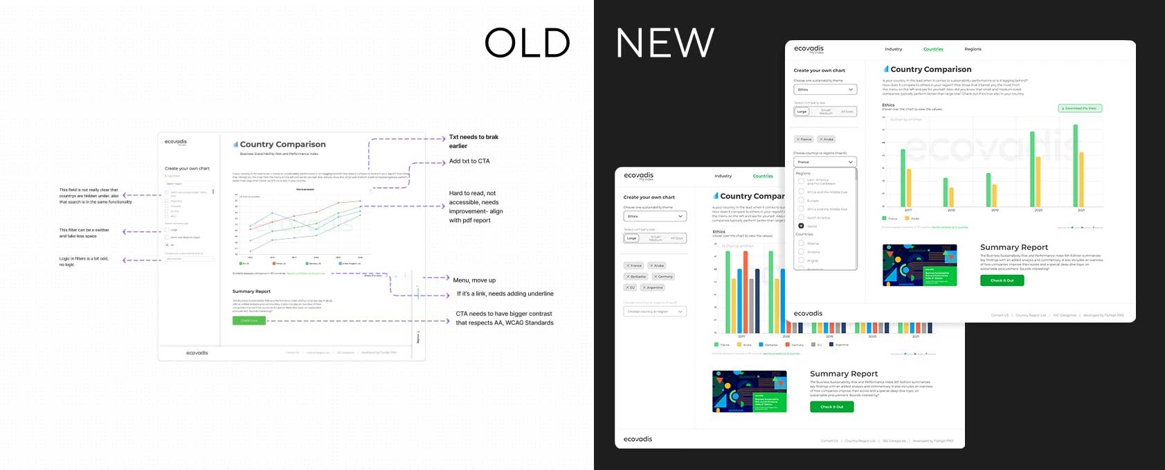
Country Comparison Tab
In previous version country and region selector/dropdown was not very clear, all positions were mixed together so there was no clear distinction between regions and countries. Also It didn’t give a clear indication that list is mostly hidden- the slider wasn’t prominent enough and whole component was morphed in to the background. I decided to create a simple dropdown. I was thinking about adding Manual input/selection but the country list isn’t full. On the dropdown we have around 80 positions. As list isn’t taking in to account whole list of countries that are around the globe but rather date from EcoVadis rating base, I decided to move all regions to the top (only 5) and add labels on top of regions and countries. All positions are formatted alphabetically and search by initial letter is enabled.
‘Download the view’ button got label so tooltip could be dropped. I also decided to reduced amount of options that user could choose from (png, jpg, svg, pdf and few more) while downloading charts. I decided to allow .jpg download only so EcoVadis logo can’t be removed and data cannot be manipulated.
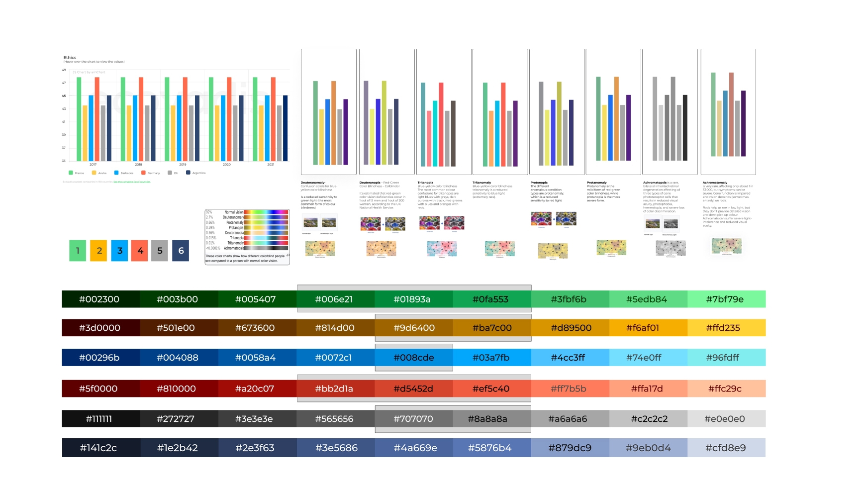
Colour Accessibility
After Conducting Research looking in to several Case Studies I tried to choose a colour palette that was still aligned with EcoVadis Brand Guidelines but a bit different so data isn’t triggering any addition associations. If i would have more time I would definitely develop a more separate but complementary colour palette for the brand that does not use any secondary colours of the brand. I used Figma and ADEE plugin to test all outcomes for the charts. I also tested different shades of every colour and how it performs with white and dark text- so while designing a pdf report, designers could use this guidance for bars and displayed text on top of them if needed in pdf version of the report.
What’s next:
This set will become a starting point of EcoVadis data visualisation colour palette when time comes. Currently we are developing new more accessible colour options for EcoVadis main pallet, next step is a development of a dark mode set. But just after those main tasks are completed, plan is to focus on accessible data visualisation set.
I am leading an accessibility project in EcoVadis. We took this opportunity and decided to make it our priority in for next few month. With this project we are looking more holistically on our brand existence online. We are trying to bring more consistency to product and marketing vision so user experience on those two fronts align.
Interesting research findings:`
Trichromacy
Normal colour vision uses all three types of cone cells which are functioning correctly. Another term for normal colour vision is trichromacy. People with normal colour vision are known as trichromats.
Statistics
There is general agreement that worldwide 8% of men and 0.5% of women have a red/green type of colour vision deficiency. These figures rise in areas where there is a greater number of white (Caucasian) people per head of population, so in Scandinavia the figures increase to approximately 10-11% of men. By contrast, in sub-Saharan Africa there are few colour blind people.
The 8% of colour blind men with inherited colour blindness can be divided approximately into 1% deuteranopes, 1% protanopes, 1% protanomalous and 5% deuteranomalous. Approximately half of colour blind people will have a mild anomalous deficiency, the other 50% have moderate or severe anomalous conditions.
Numbers of tritanopes/tritanomalous people and achromats is very small, perhaps 1 in 30-50,000 people.
Tetrachromacy ‘Super Vision’
Most people, as well as other primates like gorillas, orangutans, and chimpanzees, only see colour through three different types of cones. This colour visualisation system is known as trichromacy (“three colours”). But some evidence exists that there are people who have four distinct colour perception channels. This is known as tetrachromacy.